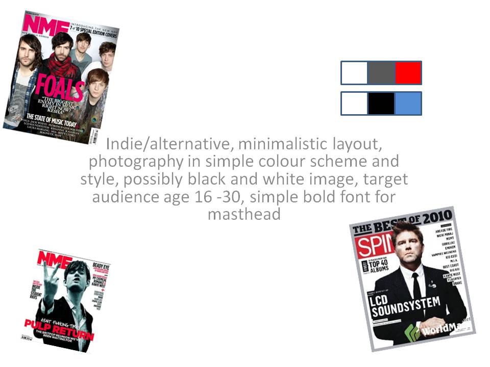
Harry this pitch shows that you have a very clear idea of what you are aiming for with your magazine and your research supports it. I get a strong feeling that your target audience is male - is this the case as this was not mentioned in your pitch? I like the strong colours that you have picked because the smal splash of colour already gives a sense of professionalism/sophistication.
i like how you've chosen to keep your magazine minimalistic and kept to a basic colour scheme, i think it'll appeal to your target audience really well.
I like how you are using little writing on your magazine and I really like the colour schemes you've used and think that they work really well together.
The age of the audience ranges high enough to be believable, the colour scheme works very well (and accounts for deviations in style within the genre, what with the red alongside the grey and white), and keeps the style of the masthead fairly simple enough to do it's job whilst conforming to past successes within the media. Quite a well done pitch.
I think the target audience is good, as the genre of your magazine seems to be able to target a wide age range. I like the simplistic layout, and the colour scheme can be very effective if used correctly.
Harry this pitch shows that you have a very clear idea of what you are aiming for with your magazine and your research supports it. I get a strong feeling that your target audience is male - is this the case as this was not mentioned in your pitch? I like the strong colours that you have picked because the smal splash of colour already gives a sense of professionalism/sophistication.
ReplyDeletei like how you've chosen to keep your magazine minimalistic and kept to a basic colour scheme, i think it'll appeal to your target audience really well.
ReplyDeleteI like how you are using little writing on your magazine and I really like the colour schemes you've used and think that they work really well together.
ReplyDeleteThe age of the audience ranges high enough to be believable, the colour scheme works very well (and accounts for deviations in style within the genre, what with the red alongside the grey and white), and keeps the style of the masthead fairly simple enough to do it's job whilst conforming to past successes within the media. Quite a well done pitch.
ReplyDeletePhenomenal pitch, the ideas are brilliant.
ReplyDeleteI think the target audience is good, as the genre of your magazine seems to be able to target a wide age range. I like the simplistic layout, and the colour scheme can be very effective if used correctly.
ReplyDelete