Friday 6 May 2011
Dear Examiner
I hope you have enjoyed my blog and found it to be of high standard. I also hope that my Magazine itself has been entertaining and interesting for you to read.
Friday 25 March 2011
Evaluation Activity 1
In what ways does your media product use, develop or challenge forms and conventions of real media products? (i.e. of music magazines)

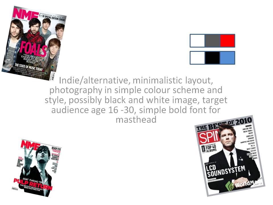
The title of my magazine ‘Radar’ is quite suitable to the indie genre. The example of New Musical Express (NME) is similar sort of title in a way. Radar represents looking for something new, and so this indicates that the magazine is interested in new music. I feel that indie is an example of a genre that is always changing and new artists help change people’s perception of ‘indie’ and my magazine could be used as a way of promoting new artists as many magazines of this type are.
My front page is set out in a fairly simple manner, the main image takes up about a third of the page as it is a full body shot as apposed to a mid shot or close up which would take up a lot more of the page. This resulted in a lot of blank white space, so I did have to put more cover lines in than i originally planned to. My drafts are good examples of how the magazine doesn’t look quite right with less cover lines, I feel the final cover has enough content to fill the page but not so much that it looks overcrowded. My contents page is set out in a more complicated and condensed manner, although I fell that it is still easy to understand and read. I have made a simple list of the features included and images of the main stories in the magazine. The double page spread is set out in quite a formal style, this arguably goes against the normal conventions of the genre where the layout can be fairly messy and a bit unconnected in places like this example from NME.

A convention I have used is having the main image on one page and article on the opposite. The example also uses some smaller images in the article which is a convention that I haven’t followed as I feel the page may have become overcrowded. This challenges the crowded nature of this genres and goes along with my idea of a simplistic style to my magazine. The model used has a fairly serious but neutral facial expression, this is due to the timid nature I imagine the artist to have. His outfit of buttoned-up shirt and skinny black jeans is suited to the indie genre. My photos contain a wide range of different shots, but I felt the full bod shot was the way to go. It does allow more space for cover lines and in a way makes the image of the artist a bit more iconic and allows the audience to see the artist in full. The images used in the contents are more ‘in action’ shots and include a caption involving what the feature is about.
The font for my masthead is ‘Headline One’ which I have also used for the page numbers on the contents page. The main font I have used is ‘Myriad Pro’ which is a simple but professional looking font. The style I wanted to get with theses fonts was again simplistic and these fonts do work well. The colour schemes in the cover, contents and double page spread all follow a fairly basic three-colour scheme. The front cover is black/red/white - these colours work quite well together and the red used makes the masthead and coverlines stick out a bit more. The contents page is a mixture of grey, black and white which makes it seem a bit more simplistic. The double page spread has a similar scheme to the cover with black, white and the one contrasting colour - green. Indie magazines can have a very untidy colour scheme and make the covers themselves look again overcrowded. This is an example of this:

The aim I personally had was to make the magazine look as ‘real’ as possible. I tried to use many features to make it seem as professional as possible. The artist on the front therefore had to be represented in a way so he looked like a professional artist and suit the genre. His blank expression indicates a from of arrogance but is also quite neutral but the hint of arrogance is almost typical of some indie artists. Magazines of the Indie genre are usually quite cluttered and potentially overcrowded in most cases, so I feel my magazine challenges these traditions in this way.
Evaluation Activity 2
How does your media product represent particular social groups?

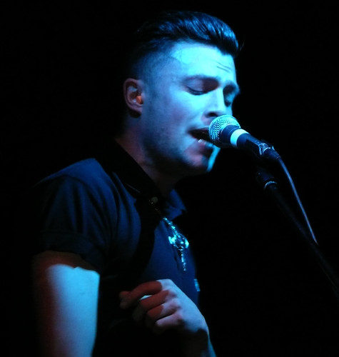
The image of Orlando Weeks shows him in a similar outfit to my artist, he is in action in this shot but he has quite a calm facial expression. They are both wearing a similar short sleeve shirt with it buttoned all the way up which is more common in the Indie artists. Orlando Weeks has a very timid approach in his performance, I aim my artist’s character to be a slightly more outlandish as described in my article. In the full length shots you also see my model wearing skinny black jeans which is a common feature in indie frontmen. The shoes worn by my model are a bit more formal that the stereotypical indie artists footwear, although the model is not dressed to be on stage and is more of a formal occasion so we would expect the artist to be wearing something a bit more formal than on stage. The two are also in the same social group, they are both white, middle class. Appearance wise I have compared him to Weeks although his character is a bit more outlandish and has a 'louder' personality. I have compared Sam Burnham to other frontmen in the article, his stage style is highlighted throughout the article. He is likened to Yannis Philippakis and Ryan Jarman for being represented as a fairly adventurous character, particularly with Yannis who is known for not staying on the stage all the time when performing.
Evaluation Activity 3
What kind of media institution might distribute your media product and why?

Bauer Media is Europe’s largest privately owned publishing group. It has 19 million adults who are reached through the company’s multiple media outlets, mainly magazines and radio. Some of it’s leading magazine brands include men’s magazine FHM & ZOO, Grazia (fashion), Closer & Heat (showbiz), Empire (films), Match Magazine (sport), Kerrang (rock). It also has Q magazine which would be the closest competitor to my magazine. Although this may mean that a company would not want to take on a similar magazine to one that it already has, Bauer Media as shown above has some magazines that are even more similar and would have very similar audiences for example Closer & Heat, FHM & Zoo. Q is aimed at a slightly wider musical genre than the indie genre my magazine is targeting. This would also mean that the company would be aiming to a wider music magazine audience, with RADAR and Kerrang it would cover two more specific genres and Q may be for a wider audience. I think my magazine's unique selling point is that it is in a genre of music which is put across in a more informal manner (e.g older NME Magazines) however I feel mine puts an effective upmarket touch to this genre in my magazine.
A magazine publishing company is responsible for editing the magazine and putting it out into the media. Magazine’s are an example of ‘Periodical Literature’ where new editions are published on a regular schedule. Bauer Media obviously has great experience in this as it has done it with many magazines spread across many interests and genres.
Evaluation Activity 4
Who would be the audience for your media product?
My ideal target audience would be those that are interested in the Indie musical genre. This nowadays is a growing popularity, more and more people have different perceptions of what indie is. My audience is likely to span from older teenage (18/19) to around the ages of 30/35. I think this age range would be appropriate, the 18 year olds would not be a restriction, but as I would aim the magazine to be more sophisticated and this age group would appreciate this. I feel my magazine would be suitable for both genders as indie is a genre which is popular in both men and women. A typical member of the audience will be interested in new music in the indie genre. If their musical interest is high they will probably attend many gigs and read reviews about the best performances around the country in the magazine and where to see their favourite bands.
Typical audience member:
Age: 20
Occupation: Student
Likes/interests: Music, films, photgraphy
Favourite Bands/Artists: The Vaccines, The Maccabees, The Cribs.
Hobbies: Going to gigs, listening to music/radio watching Tv. Enjoys festivals.
Evaluation Activity 5
How did you attract/address your audience?


The colour scheme on the cover allows certain aspects to show out more than others. The contrasting red allows the main cover line and masthead to do this. The ‘2011 festival special’ grabs the readers attention as it is highlighted in a way due to it being presented differently than the other cover lines. The main coverline features the main artist of the magazine - the ‘cover story’. The coverlines in the top right are similar as they have the title and have a small description of the story included, the less important cover lines are shown in simple list from in the top left and bottom right. In the bottom left is another example of coverlines being presented in a different way to help stand out more, the feature includes different albums so are included together with the black highlight. The RADAR masthead is easy to read and in the distinctive font, will be recognisable to the audience. Along the top of the page is a lure, this competition entices the reader further into buying the magazine as they will want to be involved in the competition and could be one of the first things the reader sees as it is a the top of the page.
The contents page includes a fairly simple list form set out down the left hand side of the page. It allows it to be easily readable but still shown in a style that works well. It has the features which would be in every issue of the magazine, under ‘monthly’. Then the features which are in the magazine are shown underneath. These stories are the ones that the magazine will be bought for, from non-subscribers. The people who will buy the magazine for a particular artist or band, whether they are on the cover or have a review or interview with them. The cover story is presented with the large image on the page, with a title shown on the image and what page the feature is on. The other main features in the article are shown with smaller pictures and presented with the same text box and page number.
The layout of the double page spread is simplistic but still features a lot of information and stories about the artist. The quote shown next to the artist is selected to attract the reader who may not be seeking to read the article in a way. It is shown to sum up the article and give the reader an idea of what it is about and aims to entice them into reading on. Like the cover, ‘SAM BURNHAM’ is presented quite clearly so that at first glance the reader will know what the article is about and who the artist is. The image shows the artist in a slightly more casual manner than on the cover, with his shirt undone. This could be representing the informality of the interview in the article and also shows the artist as being a bit less ‘rigid’ in his appearance.
Evaluation Activity 6
What have you learnt about technologies from the process of constructing this product?
Camera
For the images I took for my magazine I used a Canon EOS 1000D DSLR. In using this, I could take many high quality photos in quick succession. The manual setting allowed me to adapt the white balance, depth of field, focus etc. to get the best quality images possible. Before I would use a digital camera with automatic settings, but now I know how much better quality images can be achieved using a manual SLR.
Computers
I used my macbook to make my magazine, this allowed programs like photoshop to run faster and more efficiently allowing me to complete my magazine quicker and to a higher quality.
Software
The latest Adobe Photoshop - CS5 is a great program to edit photos and set out the magazine. I originally knew how to do some simple things on it, but as I started to put my magazine together I learnt new ways to use the program and benefitted with my magazine. I used Pages as a word processor to write up all my documents I needed. The web applications I used for research in particular include scribd, to help upload my documents and animoto to make animated presentations.
iPhone
I used my phone as a way to take notes when away from a computer and take photos to help me in my preliminary tasks and test shooting.
iPhone
I used my phone as a way to take notes when away from a computer and take photos to help me in my preliminary tasks and test shooting.


Evaluation Activity 7
Looking back at your preliminary task (the school magazine task), what do you feel you have learnt in the progression from it to full product?

From the preliminary task I learnt the basics of magazine layout, when making my magazine I quickly realised just how hard it is to produce a magazine to a professional standard. My preliminary cover features a mid shot, with a few cover lines. The image was taken on a digital camera so the quality was not the greatest, the cover lines overlap the image which makes them look a bit out of place. I feel my preliminary cover was very poor and far too basic. The font I used was a very basic and plain font, it looks very boring. On my final cover I feel the more condensed fonts I used are a bit more eye catching and interesting. I feel I eventually, with my final cover, learnt how to make a magazine eye-catching and professional-looking. The preliminary contents was also quite poor, I knew that I had left too much blank white space and did not include enough information. My final contents page was made to fill the page, but still with the aim of a simplistic style and to not overload with content. My research helped me a lot, when I was searching through many indie magazines, I also looked at some other magazines which carried a similar class that I was aiming to achieve. Esquire was a great inspiration, this magazine has a great mix of content and style and I felt elements from the magazine helped me to get a better idea of how to make a magazine look good. I think with looking at so many style models, through a variety of genres it built up my level of creativity and knowledge in how to make a magazine look good. Overall I feel when putting the final pieces together that it takes a few tries to get the layout right and looking the way you want it too, but when you have the layout right your magazine looks good and has a professional feel.
Friday 11 March 2011
Friday 4 March 2011
Cover Re-draft

Magazine improvements from feedback
From the feedback I have received from teachers and peers, i think the following improvements may be necessary:
Cover:
-Reduce the amount of text on the right of the page.
-Change colour and amount of text under 'SAM BURNHAM' coverline.
-Change colour/brightness or contrast of main image.
-Consider changing background from plain white.
Contents
-Change picture of lad in football shirt
Double Page Spread
-Check spelling errors
-Make sure article suits genre etc.
Friday 11 February 2011


Draft Article
Never will he admit it, but Sam Burnham deserves a lot of credit for the impact his band has had on the indie music world. Harry Simmons talks to the frontman who has recently had a sudden surge of interest from all corners of the music universe.
He is the stand outmember of The Lonely Future, whether he likes it or not. No-one can get enough of him at the moment. Although his arrogance is key to his performances, he is still a lovable character. His character is very unique, he has a laid back approach to everything but still manages to be perfectly organised. He arrives into the RADAR studio promptly and you can tell he knows how to work it, wether it’s the crowd at the band’s gigs or in front of our cameraman. Sam Burnham, along with Harry Smith on the drums, guitarist Max Hollander and bassist and keyboarder Pat Manson have got the mix right, the Leicestershire four-piece have really turned the indie world on it’s head. They seem to fit in perfectly with the current crop but are completely unique somehow. The Lonely Future are a band that look forward to their future and hope it won’t be lonely, they want to keep going their prominence has come swiftly but they hope to keep gathering momentum and just get better and better, Burnham in particular is hoping they do not sell out.
You seem like a very calm character, on stage you are known for some less-calm antics. What is it that changes you like this?
I’d say it’s a mix of pure adrenaline and passion really, I love playing with my mates and there’s nothing like playing in front of a crowd and really showing all your emotions. I mean, when you think your music really works, it’s a great feeling but nothing compares when you see the fans at the gigs going crazy at one of your songs it is such a special feeling. The way to thank them is to join them and that’s why I love doing all my diving into the crowd, I don’t really think about it.
You personally have received a lot of attention with The Lonely Future’s rise to fame, why do you think you have been so highly regarded?
It’s very overwhelming when anyone talks about you in the magazines or on TV. I think we all can’t believe how quickly things have changed for all of us. It’s not all about me at all, I don’t really understand it, i’d be nothing if it weren’t for Max, Pat or Harry. Obviously i’m not going to ignore the praise, I thrive on it.
As a frontman, you have been compared to the likes of Yannis Philippakis and Ryan Jarman in your style of performing. Who are your main influences?
Well I do see where your coming from there, I mean those two are great inspirations for me and they both, like me do love to show passion on stage. If i could afford to smash my guitar, I would. I grew up watching Queen because of my Dad, Freddie Mercury was always a great frontman, the way he worked the crowd was incredible. Of course i’m no where near that kind of level, yet. Nowadays I think yeah Yannis is a great role model and idol for me and a brilliant artist in a brilliant band.
So it all started for you really when you supported The Maccabees on their tour last year, would you regard that as your ‘big break’?
Yeah definitely, we were actually 4th support on most nights but it was still our first experience of going up and down the country, it was a really amazing experience. It was massive for us, not because we could book more dates but because our music was put out there, our EP was on the shelves on shops, everyone wanted pictures with us, it was mental! But yeah we seriously will always thank Orlando and the lads for letting us guys come on tour with them.
With that tour and your debuts at many of the UK festivals, it was a huge year for The Lonely Future wasn’t it?
Of course, we played in front of some mega crowds, The Maccabees tour was played in front of some huge numbers but there’s always something a bit different, the atmosphere is a bit more magical if you like. Glastonbury was amazing, the whole weekend was incredible, we’ve all been before but it’s so much different when your playing, there’s an extra buzz around you.
So do you prefer to be on tour or in the studio?
I mean, I love playing in front of crowds but they’d be none of that if we didn’t sit down write songs, and record them we couldn’t possibly set up for playing live. It’s normally a case of we want to be in the studio when we’re on tour. When we’re on the road, we moan that we’re not in the studio.
Going even further back, it all started with you jamming in Sam’s garage was it? How and why did you decide to start The Lonely Future.
Well us 4 were always good mates at school and we all loved music. Harry played drums, Max was brilliant on guitar, Pat could play pretty much anything and I yeah I could sing. So we all just thought ‘why haven’t we started a band yet?’ That’s really where it all began, and yeah it was actually my bedroom, we all crammed in and slashed it out for hours on end. Eventually the mindless thrashing turned into proper music, or at least what we thought was proper music.
So your album has just hit the shelves, already tipped to top the indie charts, how do you think it will do?
Well you can’t really answer that question, we’ll have to wait and see how it does. Most of the songs have been played out live and of course we’re hoping we get the same unbelievable reception out of the studio that we have had out on stage. Writing the album was again a great experience, we all had ideas and it gives it a really wholesome feel, we all deserve full credit for everything on the album. We hope everyone enjoys it as much as we have.
You’ve been very clear that you don’t want the band to peak too early, is that to do with the fact you’ve come to fame so quickly?
A lot has happened so quickly for us definitely, we haven’t rushed anything though. Yeah i’m determined to keep a lid on things in a way, we want to keep going and i don’t want people to think we’re ever going to sell out. If we do, make sure you let us know. We will take a long hard look at ourselves because we all hate it when we love a band, they have a brilliant debut album then their second is a mess. So I want to make sure we can please everyone and ourselves for as long as possible.
Why do you think you everyone has paid more attention to you just recently? why has hit taken a while, and then you burst onto the scene?
Well, personally the first time I felt any kind of fame was when we were asked wether our song could be put on the next Fifa game, haha. But to be honest I think when we knew the album release date just after the new year, everyone went mad for us. I’ve was told a lot of people were looking forward to it after a very successful tour with The Maccabees, so the pressure was on to deliver. I guess we did and that’s why we’re getting a bit of attention right now.
How important is image in your band?
I don’t know! We want to look cool, I think you’ll have to ask Max about this one. He’d give Mark Ronson a go in a cool list, coolness just comes naturally to him. But really, a quick answer would be ‘not really’ we care about making music and enjoying our own work, if we look good, we’ll take the compliments!
So what’s happening in 2011 for you guys?
Well we’re actually just chilling out for a bit at the start, The album’s just out so we’ll go around plugging that for a bit and then we’re lining up a tour in October and November. So I suppose this year could be as hectic as the last!
You can catch Sam Burnham answering some of your questions at www.radarmagazine.com

Tuesday 8 February 2011

Friday 4 February 2011
Front Page Mock Up
This is another draft front page, I have done one with a plain and simple white background and another with a gradient grey - white background.


Saturday 22 January 2011


Test Shots
These are some of the test shots i took using a Canon EOS 1000D. I have used different lighting and focuses for these photos. I have also used a range of different shots, from close up to long shots. These have given me some ideas as to what kind of lighting, focus and the range of shots to choose from for the photos i will take for my final piece.
Wednesday 19 January 2011
Magazine Title
I have been trying to think of potential magazine names since I began drawing inspiration for my magazine. I was looking at musical terms and thinking of using certain musical jargon, but i had no luck and drew little inspiration. I then started browsing my iTunes library to look for inspiration and came across the song 'Music Is My Radar' by Blur and felt the name 'Radar' suited perfectly as the magazine I am proposing encourages new and upcoming artists and readers will generally be those that look for these artists. So I felt Radar would be an appropriate name for my Magazine. I will consider whether to call it 'Radar Magazine' or Radar Music Magazine'.


Sunday 16 January 2011
Colour scheme ideas
For my magazine, I would like to use a simple colour scheme using a main 3 colours. I like the idea of either using black and white photography or dressing my model in black or white clothing and adapting the image to look less colourful. I would then possibly have one contrasting colour for the masthead or cover lines, this could also maybe match part of the image if it was in colour.


These two coulour palettes would i would use a black and white image with one contrasting colour, I could use a different contrasting colour depending on the image and if any colours would be relevant etc.

With just black and whites I would have the image in black and white, with the masthead and coverlines in either black or white, depending on the background. I think this would give it quite a classy look.
Thursday 13 January 2011
Font ideas
I want to use quite simplistic, not too artsy fonts for my magazine. I'd like the magazine masthead/logo to be quite a bold and condensed font possibly a bit less simple in order for it to stick out, for cover lines, titles, article etc I would like to use a basic but classy looking font, so that the reader can see it clearly and so it does not look scruffy.

Here are some of the kinds of fonts I may use, I have used www.dafont.com to find some of these and some were in Pages on my mac.

Friday 7 January 2011
Thursday 6 January 2011
Magazine Moodboard
My mood board shows some of the magazine covers that inspire the design of mine, it also features images of indie artists, these help me to get ideas for my model's clothing, stance and expressions. The images are also mainly black and white, which is a feature I am looking to use in my magazine.
Magazine Moodboard
Magazine Moodboard
Friday 17 December 2010


Subscribe to:
Posts (Atom)